Also published on UX Collective : https://uxdesign.cc/emotions-and-micro-expressions-in-ux-research-user-testing-a58b66612de
Describing the aesthetic phenomenon – the appearance of a sensory or intellectual attraction in the experience – of user interfaces and proposing hypothetical explanations.
Introduction
The consequences of the care given to aesthetics in interface design are well known: halo effect (Nikolov), aesthetic-usability effect (Kurosu and Kashimura), positive affect and its influence on cognition (Ashby and Isen), etc. The consequences yes, but not necessarily the determinants. Several designers answering a questionnaire I posted online said the aesthetics of interfaces can be defined by « Colors, Typography, Icons… ». Another respondent told me that « aesthetics are vastly underrated in the design education ». In light of these answers, it seems aesthetics lacks a deep and precise definition. This difficulty may come from the fact that the notion of aesthetics is still philosophically debated. Also, it can from the phenomenological character of aesthetics in the human factor, or the multiplicity of its possible determinants.
How to describe and explain aesthetic phenomenon of user interfaces ? Trying to find some answers, I made a list of hypothetical explanations of this phenomenon. Of course none is absolutely necessary, but only one suffice. To add to that, several can come together to compose the aesthetic nature of an interface. Surely, studying the aesthetic phenomenon of interfaces means studying aesthetics in the broad sense. Lev Manovich in The Interface as a New Aeshetic Category argues that “the rise of new media forces us to rethink our existing aesthetic categories and to consider new ones » (Manovich). In the same way, I have chosen to welcome all theories, even those which seem unreasonable a priori or which are not specific to interfaces. I share this work with you today, hoping that it will be useful or that it does not hurt.
These hypothetical explanations of interface aesthetics are classified into 9 categories. These ones move away from a sensory-centered definition of aesthetics to a purely intellectual one :
- Sensorial (stimulation of the senses),
- Perception (cognitive interpretation of sensory information),
- Ethics (implications of accessibility and ethical constraints on aesthetics),
- Technique (operator’s skill as a determinant of aesthetics),
- System (interactions between components and constraints as generators of aesthetics),
- Semantic (aesthetics by attributing meaning to perceived elements),
- Relation (aesthetics by relation to a useful end or to a mental model),
- Society (aesthetics by conformity to trends, innovations and social movements),
- Expression (aesthetics by expression of an emotion or an imaginary).
Note: the term “interface” in this article refers to “human-to-software interfaces”, commonly referred to as “user interfaces”. The term aesthetic refers to the appearance of sensory or intellectual appeal in the user experience of a product.
Aesthetic phenomenons of interfaces

Sensorial
Stimulates the Senses
One possible theory to describe and explain the aesthetics of interfaces is the ability to stimulate the senses. This ability would be activated during the process of perception, well known to cognitive psychology, at the sensory level. The perception of luminance, colors, movements, would be more stimulating when it is exogenous, when it imposes itself on the subject (Houdé). Aesthetics owes a lot to this approach. The word aesthetic comes from aisthesis, in Greek the faculty and the act of feeling. Baumgarten popularized the term as « science of the sensitive world of the knowledge of an object » (Baumgarten, 1735). Carole Talon-Hugon specifies that this etymology is opposed to another notion, the facts of intelligence, the noêta (Talon-Hugon). For now, we are on a definition centered on sensoriality. But we’ll see later in the article that the facts of intelligence have a role to play in aesthetics.
Sensorial pleasure
When Plato wonders about the essence of aesthetics (then the notion of beauty), he mentions first an « unalloyed pleasure », which appears in Philebus (also named Du Plaisir). In other words, Aesthetics, a concept which at the time did not exist, is then presented as the basic pleasure of the senses. Socrates adds that this pleasure is especially linked to hearing and sight, because they are pleasures that do not depend on the subsidy of a vital need (Lacoste).
This vision of aesthetics as « unmixed » sensory pleasure reminds this phrase of Kant: « Is beautiful what universally pleases without a concept « . Coming back to this notion of « unmixed » and « conceptless », it is understandable that Kant and Plato both admitted at one point that an explanation of aesthetics could be « simple » sensory pleasure, without intellectualization. The two philosophers will go much further in their analysis of aesthetics, as we will see later in the article.
For an interface to be a source of sensory pleasure, the designer has a few levers. Anton Nikolov listed the sensory qualities that different types of products could have: color, shape, texture, movement. , temperature, vibration… (Nikolov).
The pleasure of hearing is not outdone since it is very much worked on by sound engineers. Anton Nikolov speaks this time of Loudness, Pitch, Beat, Repetition, among others. To add to that, a notion of auditory aesthetics appears in the video animated by Andrew Stafford and Steve Milton (https://www.youtube.com/watch?v=S_gBMJe9A6Q) (Stafford and Milton). Beyond auditory pleasure, the two animators approach a more intellectualized point of view with skeuomorphism, emotional reactions, and semantics.
The idea that a product should satisfy sensory pleasure, and therefore express some beauty for the senses, is no stranger to ergonomics. Among other qualities that should have an ergonomic product (effectiveness: to achieve a goal, efficiency: to facilitate the achievement of a goal, etc.) Brangier & Barcenilla describe the notion of Satisfaction, from which derives « physical pleasures: related to the body and derived from our sensory organs » (Brangier and Barcenilla 50, 72). We can note how, from the point of view of ergonomics, the notion of aesthetics is agglomerated with that of sensory pleasure in the concept of Satisfaction, that is to say in the judgment that the user will make on the product studied.
Simulation likelihood
In the world of Virtual Reality in particular, the quality of the work is measured by the plausibility of the sensory simulation. It is one of the criteria allowing users to immerse in a virtual universe, the others being the degree of interactivity and the speed of execution (Vlachopoulou and Missonnier). The stronger this likelihood, the more the user will be able to deceive his own senses. In most cases, this likelihood comes from 3D models, textures, lighting, post-production effects, and more generally graphics engines.
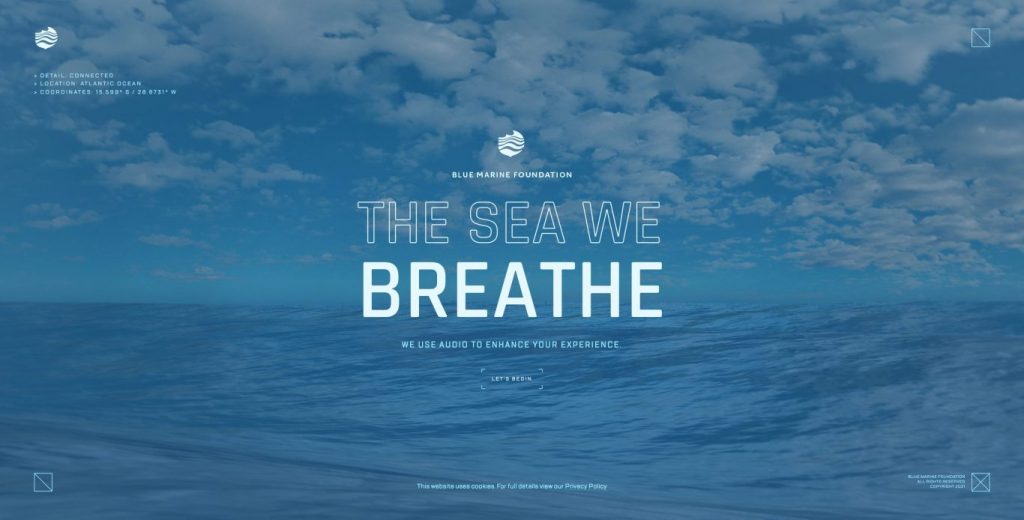
This is also true for some websites that exploit 3D technology to its fullest, such as https://www.bluemarinefoundation.com/the-sea-we-breathe/ for example. We can hypothesize that the aesthetic of this experience can come from the recognition of developer’s skills. But more especially, from the medium’s capacity to imitate the current reality or to be plausible, thanks to this skill. Thus the notion of aesthetics would be linked, in this context, to that of plausibility.
Perception
Ease the perception process
To go into the field of psychology, Rolf Reber, Norbert Schwarz, Piotr Winkielman posed the following hypothesis: « aesthetic pleasure is a function of the perceiver’s processing dynamics: The more fluently perceivers can process an object, the more positive their aesthetic response » (Reber et al.). In their study, this hypothesis is not rejected, but the authors specify that aesthetic appreciation still depends on the subject’s mental configuration (Hanchar, 7). Based on this study, one can understand that the interfaces that facilitate the mental process of perception are aesthetic. Also, you can read their abstract, to see how they translated aesthetics in variables (figural goodness, figure-ground contrast, stimulus repetition…) (Reber et al. ; https://journals.sagepub.com/doi/10.1207/s15327957pspr0804_3).
Anna Hanchar, in her final thesis, notes 3 essential factors to qualify an interface as aesthetic (visual complexity, prototypicality and color typicality) but specifies that other factors have been approached by other researchers, such as the « amount of information, symmetry, and clarity » (Hanchar), factors which both determine aesthetics and facilitate the processing of visual information during perception. As a reminder, the perception level in cognitive psychology is the step during which the brain processes sensory information through cognitive operations (distinction of background and foreground, complete the missing elements to give unity and consistency to an object…) (Houdé 89). The notion of « processing fluency », for its part, represents the ease with which information is processed mentally.
Closer to the aesthetic subject, Adam L. Alter and Daniel M. Oppenheimer use the term « perceptual fluency » to denote the ease of the process of perception. It is explored by researchers by varying typographies and colors in experimental tests of printed information perception (Alter and Oppenheimer). The Harvard Business Review to add: « You may sense something about a chart you like – you may even be able to describe it as *clear* or *revealing* without understanding that you’re actually describing elementary encodings or perceptual salience” (Berinato).
The notion of aesthetics in interface design is mainly based on the idea that perceptual fluency equal looks good. This is one idea that we can hear from an article from the Nielsen Norman Group (https://www.nngroup.com/articles/why-does-design-look-good/?lm=color-enhance-design&pt=article). For them, the aesthetics of an interface is established by « typography, establish a clear hierarchy, utilize a refined color palette, and align to a grid ». These elements conforms with an objective of visual beauty but also of perceptual comfort (Gibbons and Gordon). In addition, more criterias are cited by John Grishin, and Douglas J. Gillan in Exploring the Boundary Conditions of the Effect of Aesthetics on Perceived Usability, a study somewhat similar to those previously cited: « Graphics in place of text where possible is more aesthetically appealing than dense text », » Less cluttered is more aesthetically appealing than cluttered » (Grishin and Gillian).
Diametrically opposed colors on the chromatic circle
Among the perceptual phenomena specific to color, we can of course cite that of complementary colors. « They say that the eye claims all colors » announces Amandine Gallienne. The aesthetic principle of complementary colors is due to the fact that our perception process continually tries to reconstitute the entire chromatic circle during the color perception stage (more precisely, when we perceive a color, the photosensitive cells of our retina try to simulate the presence of its complementary; a phenomenon described by Amandine Gallienne) (Gallienne).
By offering the eye complementary colors on the same « scene », it is easier for the eye to carry out this work of completion because these colors divide the chromatic circle into equal parts, making it easier to « browse ». The aesthetic thus generated is then explained by an economy of the cognitive work of perception. In the case of digital interfaces, we must consider the additive complements, obtained by adding colored lights by the primary which are red, green and blue. Nielsen Norman Group article on color, which recalls the basics: https://www.nngroup.com/articles/color-enhance-design/.
Shiny colors
Among the properties of beauty, we find in Saint Thomas the idea that « things are declared beautiful which have a color that shines » (Saint Thomas). We find this same idea in John Grishin and Douglas J. Gillan who states that « Color is more aesthetically appealing than black and white » (Grishin and Gillian). The choice of color may seem obvious for some sites like https://www.vangoghmuseum.nl/en . For others, it is a more or less arbitrary choice. It seems to me that this notion of radiance is taken by a lot of UI designers who fully assume the additive spectrum by offering their users saturated and luminous colors. An example on https://www.ces.tech/.
Ability to be imperceptible
The screen should no longer act as a screen. If we take the interface in its most literal sense, we will have the definition of an object that is not supposed to exist outside of its main functionality: the interconnection. The interface is by nature an abstraction; the abstraction of the object it represents. If we push this definition to the extreme, we can start to think that the best interface is the one that is imperceptible, because it would then be pure abstraction.
In this case, does the study of the aesthetics of interfaces make sense? Yes, because it takes a lot of aesthetic work to make an interface imperceptible. Thus, we can hypothesize that is aesthetic an interface created in such a way that it becomes imperceptible while putting in relation two entities. In particular, it would facilitate the process of perception to such an extent that its presence would eventually disappear from the user’s consciousness because it offered no point of « cognitive friction ».
This last idea is brought by G. Lombard’s « hidden third party in the binary » to describe the unconscious presence of the medium while users communicate via new technologies (Lombard). In her analysis, this presence of the medium is so perceptible, at levels perhaps more intellectual than the sensory perception, that it comes to modify the behaviors of the users who communicate online. Another way to approach the subject would be to explore technologies that are so advanced that they do not require visual interfacing.
The question is asked by the Creative AI Lab to Christian Ulrik Andersen, Agnes Cameron and Rebecca Fiebrink: « If machine learning is a new paradigm in computing, then why is there no new interface? » (Andersen et al.). I prefer not to risk myself to summarize their discussions as the points raised are numerous, but I will leave you the pleasure of exploring their work. In a completely different approach, just for fun, we can cite the effect of diegetic interfaces in the video game, which completely cancel out the abstract representation of the elements of the interface.
Multi-dimensional
It is easy to hypothesize that the aesthetics of an interface can be the consequence of the latter’s capacity to invest several dimensions. Video game interfaces play a lot on this ability to put a menu, a button, an icon into perspective. The interface of the Gran Turismo 4 game had met with great success by presenting a menu in the form of a map of a city whose interactive elements are in 3 dimensions (https://gran-turismo.fandom.com/wiki/Menu_Styles?file=Gt4.jpg). To please fans, the game Gran Turismo 7 uses the same principle.
Another game, French this time, has its interface on the same matrix which governs its entire virtual universe; Detroit: become human. We can also cite the objectives display in Splinter Cell : Blacklist (https://www.jeuxvideo.com/screenshots/74961-1287889-0). Of course, VR interfaces do the same. In websites, the technology WebGL and Three.js allows developers to display 3D scenes in a browser. But in the more limited websites and mobile apps, designers have found other ways to invest a third dimension, as Rodrigo Osornio explains in his article Tridimensionality: skeuomorphism, flat design, and neumorphism, which presents 2 stylizations based on this principle: skeuomorphism and neumorphism (https://uxdesign.cc/tridimensionality-of-skeuomorphism-flat-design-and-neumorphism-bc9d705a5cc7 ) (Osornio).
Sobriety as a graphic intention
We can note a desire of certain designers to achieve a minimalist design. The trend was popularized by an artistic movement of the 1960s, everyone knows Mies van der Rohe’s expression: “less is more”. It seems to me that most interface designers today have accepted that aesthetics equal minimalism. For example, not surprisingly, the site https://www.vitsoe.com/eu cultivates this approach, which is taken to a climax at https://www.theminimalists.com/start/ or even https: // manuelmoreale.com/ .

The Nielsen-Norman Group assimilates the two concepts in one of their rare articles on interface aesthetics (https://www.nngroup.com/articles/aesthetic-minimalist-design/). They go far enough to make it a heuristic (Fessenden). This assimilation come from researchers such as Koutsabasis and Istikopoulou. These last two have demonstrated the existence of a « negative correlation between pleasure and visual complexity ». In this context, complexity is being understood as the reverse of « clear, clean and beautiful » (Koutsabasis and Istikopoulou). The study is cited in Anna Hanchar’s thesis who specifies that « Websites of low visual complexity and high prototypicality were perceived as more attractive ». She also specifies that “For instance, within the scope of Gestalt psychology, such parameters as amount of information, symmetry, and clarity are considered important for aesthetic perception” (Hanchar).
In a work led by Ola Benderius, Christian Berger, and Victor Malmsten Lundgren, as part of a competition to design the interior and exterior interface of autonomous vehicles in 2016 (thanks to the anonymous who shared this link in my online survey, very interesting), one of the jury’s criteria is « Aesthetics & Minimalism: does the interface provide a good user experience, and does it avoid clutter? » (Benderius et al.). Here again, aesthetics is assimilated to minimalism.
Research tends to show that adopting a minimalist design improves aesthetics by reducing the noise caused by unnecessary graphic elements and therefore by facilitating the perception of important information, which is then called « clarity « . However, this amalgamation between minimalism and clarity poses a question of definition; does minimalist design guarantee clearly presented information? This is to forget that during perception, some elements will be more salient for one user than another. Indeed, perception can be motivated by an exogenous (external stimulation) or endogenous (for a purpose) stimuli (Houdé).

Ethics
Constraint determine aesthetics
To get out of an alleged contradiction between aesthetics and ergonomics, we can hypothesize that ergonomics determines aesthetics. More precisely, ergonomic and accessibility constraints are the driving force that allows aesthetics to come true. We are able, thanks to WR Reitman, to define the notion of constraint in a creative resolution of a problem. It is an « operator of scarcity » because it pushes the researcher to rule out inadequate solutions, and « operator of transition « because it guides research in its process (Rouquette).
The designer working on an interface must obey certain ergonomic and accessibility constraints. These are the minimum size of the text, the contrast of the background and shapes, the restrictions of animations, etc. It creates an aesthetic that would not have seen the light of day without the application of these constraints. Thus, ergonomics and accessibility go hand in hand with aesthetics.
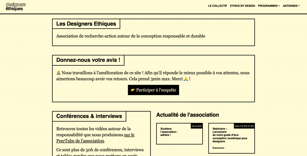
The point is raised by Alex Chen in his article Accessibility drives aesthetics, in which he notably cites OXO, Eames and GOV.UK as examples of products / services that have perfectly incorporated ethical constraints in their design process of their aesthetics (Chen). We find this idea in the concept of Satisfaction of Brangier & Barcenilla, the « level of comfort felt by the user when using a product », the comfort being in the use and the visual pleasure (Brangier and Barcenilla). An example of a site whose aesthetics are determined by accessibility: https://designersethiques.org/ .
Ethics is aesthetic
Faced with the overconsumption of energy from computer tools, one can wonder whether the splendor of superfluous effects such as animations and javascript-things don’t bring a certain ugliness to interfaces. We could take up here the idea of Rousseau for whom pomp is not so much the antonym of sobriety as of virtue (Castarède). We could therefore also pose the hypothesis, pushing the concept a bit, that what is ethical is aesthetic.

Technique
Created by a remarkable skill
Plato gives an explanation of the beauty of objects in the notion of technê, technique. This concept rely to the ability, the finesse, the skill in the choice of the means to produce a work. Kant approaches art from this same perspective by using the term Kunstwerk, in German « work of art « , which can also mean the manual work of the craftsman (Lacoste).
In the design of digital interfaces, this notion is not absent. Through the universe of UI Design, a lot of people on social networks describe how to create the perfect shade, choose colors carefully, match two different typographies, choose a gradient, etc. It finds its paroxysm among the most creative and the most daring who know how to take full advantage of web technologies, whose works can be found at https://www.awwwards.com/. In the manner of craftsmen who work a material with finesse and skill, UI designers have their codes, their expectations; it is therefore also a social factor, as we will see later in this article.
System
Emerging aesthetics
To describe an aesthetic phenomenon due to a system logic, I would like to talk to you about Jackson Pollock. He was a painter, and painted instinctively, without a clear vision. He has only two variables to determine what his painting will be: the color and the size of the paint “drip”. Pollock brings out his painting in a chaotic manner, depending on the generation of more or less random color surges. In the end, his painting, although generated without planning, is the result of a statistically correct fractal system.
This is what several scientists show, using the so-called ‘boxcounting’ method. It consists of dividing the canvas into cells of a matrix, a two-dimensional grid. We can already see the systemic character of this aesthetic emerging. Through their study of Pollock’s paintings (especially the Alchemy painting), they discovered not only that the paintings follow a fractal logic, but that this logic becomes more and more structuring in his works (Taylor et al.).
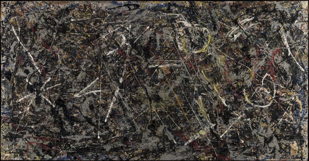
Pollock does not know what he is painting. The aesthetics of his painting are self-generated according to a system with variables. This way that Pollock’s aesthetic has self-generation is reminiscent of the field of data visualization. If you’ve ever had the opportunity to do this, you may have noticed that the whole point of this exercise is that you don’t know what the end result will look like (for exemple, you can check one of my dataviz at http://amat-design.com/prod/cartographie-de-l-imaginaire/?). Designing a data visualization means setting rules. It is only once it has been supplied with data that the visualization, the canvas, sees its final aesthetic emerging.
« What if Pollock had reversed the challenge. What if instead of making art without thinking, he said : You know what? I can’t paint anything, unless I know exactly why I’m doing it. What would have happened? » (Nathan from Ex Machina). Whether in the case of Jackson Pollock’s canvases or a dataviz, the aesthetic is invested in the degrees of freedom of the system. Also the way in which the medium is populated by data: “Research supports the idea of the interface as an aesthetic realm where form and content is inseparable” (Soon).
Elements uniformity
One of the points that is interesting to note when reading the article by J. Grishin and Douglas J. Gillan on the relationship between apparent usability and aesthetics, which takes up that of Kurosu and Kashimura (Kurosu and Kashimura), is how aesthetics are defined. In particular, one of the points mentioned is the unity of the constituent elements of the interface: « Unifying graphic elements, such as tool lines and borders, can make a website more aesthetically appealing » (Grishin and Gillian). This notion of uniformity is one of the main reasons why designers find great value in Design Systems. Beyond the practical advantages, a Design System makes it possible to approach an aesthetically coherent design.
Designing a work according to a systemic approach is a practice as old as the notion of art itself. We owe to the Philebus this quote: « everywhere measure and proportion result in the production of beauty and some excellence », and to the Gorgias this one: « Each of them proposes a certain order when he puts each of the things in its place. that he has to place and he compels one to be what suits the other, or to adjust to it, until the whole constitutes a work which realizes an order and an arrangement « .
However, the culture of systems transforms our current society ; I feel like this quote from Winnie Soon is particularly relevant for the UX community: “The change is transited from an object-oriented to a systems-oriented culture” (Soon). In the Middle Ages, the systematic aspect of the conception of the world, and in particular the understanding of the golden ratio, was considered a divine fact.
Application of the Golden Ratio in Design
Gustav Fechner (1801-1887) is known to be one of the founders of experimental psychology. He conducted a study in which he presented rectangles of different proportions to selected subjects at random. Then, he asked them to choose among these rectangles the one that seemed to them the most aesthetic. The rectangle that was most often chosen had a ratio of 34/21, which is very close to the golden ratio (34 and 21 being two consecutive numbers in the Fibonacci sequence). Through this experience, he studies a theory spread since ancient Greece. A theory that holds that golden ratio is the key of natural beauty and structures.
For a long time, artists and architects have explored the applications of the golden ratio in their achievements. Most of these applications are systemic: Le Corbusier modulor is a « key » which determines the design of the components of his architecture, Leonardo da Vinci uses the « aurea section » in the design of many creations… the examples are numerous. How can the golden ratio be at the origin of the aesthetics of an interface? To have a deeper exploration of the question, I send you to my article on the subject ( https://uxdesign.cc/design-system-based-on-the-golden-ratio-ui -% C9% B8-e45eb98655cb? Sk = 24f9184447ca3c8fdc786a0c49cd5b8d ). More recently, the Nielsen Norman Group also published an article on the subject: https://www.nngroup.com/articles/golden-ratio-ui-design .
Semantic
Significance of each elements
Let’s take a more intellectual definition of aesthetics and consider the possibility that it is generated at the cognitive level. The process of perception is closed by the attribution of meaning to the elements perceived in the preceding stages, sensory and perceptual. To this, let’s add that the human mind is a « machine to manufacture meaning » (Houdé). The semantic function is strongly linked to memorization since it allows categorizing the elements perceived. It is thus possible to hypothesize that aesthetics can be the result of an encounter between sensory and semantic perception, allowing the satisfaction of both sensory and ideological pleasure.
This theory is nothing new: the history of art is riddled with works whose artistic quality is attributed as much to the beauty of the artist’s gesture and to the beauty of the meaning that is conveyed. In interface design, one can imagine that a design supported by semantics generates aesthetics: colors can have a meaning, the size of the texts, the underline, the treatment of the images… just about all the constituent elements can have semantic.
Metaphor of a physical medium
The aesthetics of an interface, in addition to being semantic, can also be metaphorical. Perhaps the most popular example is Material design. It is a design system conceived with the idea of being a metaphor of paper medium. In addition to realistic shadows and « flat design » stylization, the colors of the Material design are slightly desaturated to mimic the subtractive spectrum (unlike the additive spectrum). In other words, colors imitate colored materials instead of assuming to be colored lights.
Colors as a mean of communicating information
The semantics of colors is a well-known area of interface design. A basic approach is to code colors by hue: eg. red = error. In their proposed interface for autonomous vehicles, Benderius, Berger, and Lundgren imagine a mathematical function to generate an increasingly saturated amber color as an obstacle approaches the vehicle (Benderius et al.). In the same way, it is possible to consider the physical effect of the color by defining them by the level of radiation that they return. As a reminder, we perceive radiation between 380 nanometers (purple) and 730 nanometers (red). It is then possible to link the hierarchy of information to the radiation level returned by the colors assigned. AlterSpark offers to map the colors of the interface elements by hue and semantic correspondence: https://www.alterspark.com/color-psychology/ui-color-psychology-map (Cugelman and Cugelman).
Relation
Conformity with a useful purpose
Philosophers have already theorized the possibility of a more intellectual approach to aesthetics, Plato and Kant in particular. One of these is to grasp a relationship between form and conformity to a useful good. For instance, if we touch the curves intended for aerodynamics of an airplane or a sports car, some beauty can be achieved. Likewise, the beauty of an architecture can be seen in its ability to match the shape of it’s traffic flows. “This architecture is never based on the radical requirements of functionalism, but on the contrary on the search for new, diversified and always logical solutions, in line with the constructive system. And this, without contradiction between form, technique and function, in the conviction that only beautiful, unexpected and harmonious solutions remain. ”(Niemeyer).
In interface design, this relationship is even more obvious. Undeniably an interface does not exist without conforming to a useful good. This is probably why the user-centered design paradigm have become the main one in this field. An architecture can be determined by the traffic flows that will take place there. It owes its aesthetics to the conformity to these flows and to the different stages of the user experience (Makstutis). It is the same with the interfaces which, according to user-centered paradigm, must adopt a particular form in conformity with these user flows. This last one will then be one of the determinants of aesthetic. In another way, aesthetics can be directed by conformity to a context of use.
For example, the simplicity of the interfaces of Kindle readers, which have significant technical constraints in particular; we understand that the use of sepia and the limitation of animations (inability to animate a scroll) or the non-multiplicity of colors (the E-Ink Pearl screen only displays 16 levels of gray), etc. is due to the relationship that the interface has with its context of use (reading for a long time, sometimes in poorly lit environments, being focused on the content …) and its technical limitations. Therefore, the interface is designed in relation to these constraints. These interfaces have their own aesthetic, consistent with the final utility of the product.
Match between colors and shapes
It is also conceivable that aesthetic is due to the relation between the different compositions of its graphic elements. The painter Kandinsky explores this possibility: « In any case, the properties of high-pitched colors sound best in a high-pitched form (thus yellow in a triangle). Deep colors are enhanced in their effect by round shapes (thus blue in a circle). However, it is obvious that the discrepancy between form and color should not be considered as something inharmonious. but on the contrary as a new possibility and therefore, also, a harmony. being infinite, these combinations, and therefore these effects, are unlimited. This material is inexhaustible ”(Sarget).
Prototypicality
Aesthetics as conformity to an archetype is also a fact of art. This is noticed in particular by Plato through the notion of mimesis. He analyzes the art of the painter as the capacity to give substance to a representation. Not the representation of reality, but the representation of an archetype, of an absolute idea. A prototype that does not exist in the real world but only in the shared world of the imaginary.
In her final thesis, Anna Hanchar speaks of prototypicality to designate a phenomenon of relational aesthetics of interfaces. Users who have already integrated an interface as mental model, which will be represented by a prototype (a perfect example) will be inclined to judge one similar to this prototype as aesthetic (Hanchar).

Society
Possession of a unique visual identity
The Nielsen Norman Group recognizes that the aesthetics of an interface contribute to creating a memorable user experience, and thus confirming the identity of a brand in the latter (https://www.youtube.com/watch?v = ZgbRmeWDgd0). From there, we can have fun posing the opposite hypothesis: the search for a unique visual identity determines the aesthetics of the interface. This reflection appears in a study called Personality of Interaction: Expressing Brand Personalities Through Interaction Aesthetics. They provide designers with systematic means of reflecting a brand image through the aesthetics of interfaces (Aagesen and Heyer). Examples exist on brand sites but also on digital agencies, and perhaps even more in designers’ portfolios such as https://victoiredouy.com/.
What is new is aesthetic
Let us pose the following hypothesis: is aesthetic what is new. This is not a far-fetched hypothesis, thanks to the work of sociologists we know the passion for the new, « neomania ». Guillaume Erner, in Sociologie des Tendances, quotes the sociologist Colin Campbell. This one describes in his study, The Romantic Ethic and the Spirit of Modern Consumerism, the love of the new appears as a response of the bourgeoisie to several centuries of conservatism, at a time where the rise in the standard of living allows quantitative consumption (18th century) (Campbell).
The question we can then ask ourselves: are the users of digital products potentially Emma Bovaries? A first element of response is given by Anna Hanchar who specifies that the « websites with less typical color concepts were perceived as more attractive compared to those with more typical color concepts » (Hanchar).
Compliance with a functional trend
In the world of user interfaces, some aesthetic appreciation factors are social. These may belong to a functional trend, led by technical progress or the fundamental movements of society (Erner). The release of the first Iphone was a breaking point leading to a technological but also aesthetic trend (2007). We could also have mentioned the Internet of Things or smart watches. To give rise to a functional trend, a new technology must first be adopted by a population of users. This is why aesthetics (as well as the entire user experience) have a key role to play. In most cases it is inseparable from the process of innovation.
The revolution created by the iPhone might not have spread the technology of the touch screen the same way if it had been done without the design of Jonathan Ive (Chief Design Officer at Apple at this time), not to mention the design of the interfaces created in a company that years earlier hosted a certain Don Norman (I will not do the affront to present him) (Vial). The underlying mechanism is indeed societal, as ethnotechnology researchers claim that a dialectic emerges between society and technology. One in turn is influencing the other (Gaudin). Bringing new technology to market generates new social practices, including new aesthetics. In turn it will generate the need for technological innovation. Thus, one can hypothesize that an interface which conforms to a functional trend is aesthetic.
Compliance with a non-functional trend
G. Erner in Sociology of Trends insists on the inability of sociologists to explain the shift in tastes and colors. “The modes constitute for the human sciences a silent reminder” (Erner). The determinants would be too numerous and complex to be approached by the traditional methods of sociology. Still, what he calls “collective arbitrary” exists as much in fashion (and are studied by companies like, for example, https://nellyrodi.com/categorie-produit/editions/) as in interface design and is of course decisive for the aesthetics of interfaces. Thus, one can hypothesize that an interface which conforms to a non-functional tendency is aesthetic.
Therefore, in most studies about interface design, these are considerations that can seem a bit trivial. For instance, Designmodo shows 2021 webdesign trends with Layered Effects, Split-Screen Aesthetics, among others (https://designmodo.com/web-design-trends-2022/) (Cousins). Undoubtedly most designers are too attached to the human sciences to enter the game of non-functional trends. This one ignores any socio-psychological implication in the choice of one pattern or another, or one aesthetic or another. But let’s not be too severe in condemning the arbitrary choices of tastes and colors. Erner reminds that the humanities don’t allow to be fully aware of the whole phenomenological reality of the user experience. It will be necessary to admit that while studying behaviors and opinions, many determinants may escape the researcher. In particular the user’s collective arbitrariness.
Compliance with social group codes
« Knowing that our own individual judgment is worthless, we strive to rely on the judgment of the rest of the world » (John Maynard Keynes, quoted by Erner). In a social understanding of aesthetics, the elements which constitute this aesthetic have a socially recognized value. The dominant social classes have long represented a community holding a « coded language of power » (Castarède). One motivation to consume a product is the capacity that it has to bring into a circle of initiates. The product is a factor of social identification. Aesthetics is then a fact of society, conformity to the codes of social dominance. Jean Baudrillard has dissected this phenomenon of products raising you to a higher social status (Jean Baudrillard, cited by Erner).
When I asked designers to tell me which sites or apps they found particularly attractive, Apple’s digital products came back. We can assume that Apple actually has the keys to a specially advanced aesthetic. But Apple may also bring a prototype of products that are the sign of belonging to the dominant social class. This may be due to the high price of these products, inaccessible to the less well-off classes. Apple interfaces would then be seen as the legitimate canon of interface aesthetics for social reasons. Then, the mimetic function of human beings and the work of communication, described in particular by Gabriel Tarde and Richard Dawkins are responsible for disseminating these codes (Tarde) (https://fr.wikipedia.org/wiki/M%C3%A9m%C3%A9tique).
Obey a law
Aesthetics can also be the result of compliance with rules. This idea is addressed by Plato in The Laws. Egyptian art is described as the only true art form because the rules that govern it have been fixed forever. Aesthetics are described as compliance with strict legislation, which guarantees consistency and continuity. In interface design, we sometimes find this idea that aesthetics are the result of legislation.
In UI, it is not difficult to find the « laws ». They describe how to create the perfect shadow, or how to choose colors, etc. Thus, the aesthetics of an interface can be explained by the assiduous application of these laws. Of course these laws are created and maintained by a social group. The aesthetics of interfaces becomes a technical fact, but also a social one. Then there are international standards. In their study on autonomous vehicles, Benderius, Christian Berger, and Victor Malmsten Lundgren had to refrain from using red to meet an international standard (Benderius et al.).
Aesthetics depend on the culture
Aesthetics are also cultural, as Yuki Zhong points out in his article Content or white space? Chinese vs. Western design aesthetics (https://uxdesign.cc/content-or-white-space-chinese-vs-western-design-aesthetics-2eef79e12844) where she studies the consequences of language standards in the aesthetics of interfaces of different cultures (Zhong).

Expression
Expression of an emotion
Let us pose the following hypothesis: the aesthetic phenomenon comes from the capacity of the medium to communicate an emotion. In the twentieth century, modern painters were no longer content to approach art and aesthetics as a strictly technical discipline. In parallel with the rise of psychoanalysis, they saw artistic aesthetics as the expression of individual emotions and imagination. For many artists, color in particular is the preferred vehicle for emotions. Personally, the site https://www.inverse.com/ reminds me of Vlaminck or Matisse, representatives of Fauvism who exalt colors to express emotions. But the website is also representative of an imaginary that I would call Blade Runner’s style science-fiction. Aesthetics in that case is achieved by the expression of emotions or imaginary.
Concordance with Durand-Minkowski profiles
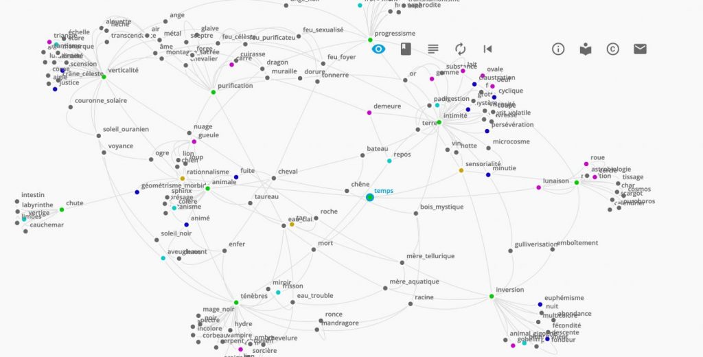
Gilbert Durand is among those who have succeeded the most in conceptualizing a systemic analysis of the imaginary. To achieve it, he relies among others on the work of Minkowski. Using the Rorschach test, Minkowski ends up identifying two groups, the « sensory-epileptoids » and the « rational-schizoids » (Minkowski). To sum up, the subjects of the first group would tend to see in the Rorschach plates a multitude of details, an infinite microcosm, deprived of any general form. The subjects of the second, on the contrary, tend to see in the same plates a uniform, indivisible, perfectly defined object. From this observation, Gilbert Durand creates a matrix on which he places a large quantity of imaginary productions (works of art, collective myths, etc.).
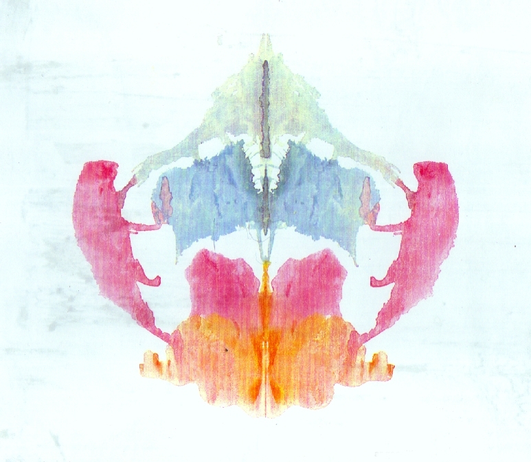
This matrix is summed up in the opposition of an epileptoid type who wants to “reconcile, soften and feel”, with a schizoid type who wants to “separate, crush and abstract” (transform into abstraction). Among the productions of the imagination that he analyzes, he notably cites Van Gogh as one of the eminent representatives of epileptoids, and Dali or Mondrian as schizoids. To add to this, he poses a third category in his matrix, which wants to be a dialectic of the first two themes, and which express an imaginary of sexuality and progress, of renewal (Durand).
Although a little lunar at first glance, this approach, which would consist in positing the hypothesis that objects whose appearance conforms to one of these typologies are aesthetic, can lead us to analyze the illustrations offered to users on their interfaces. We can risk finding a concordance between the epileptoid-sensory type in the illustrations on the site https://www.airbnb.co.uk/ for example, which are pencil line drawings, textured, filled with various colors, which represent microcosms that seem to agglutinate into a whole. In many other examples of websites, we find an idea of euphemization – to use Gilbert Durand’s words – in the use of “cartoon” isometric illustrations in which shapes and colors are softened, the first being rounded and the second being desaturated, this idea of euphemization being strongly linked to the epileptoid-sensory type which, again, wants to “reconcile, soften and feel”.
Conversely, we can risk seeing on the site https://www.tesla.com/ the features of a schizoid-rational profile just as much in the very angular and cut out logo as in the monolithic and smooth aspect. of the page structure, and in the illustrations with marked vanishing lines, with well-defined shapes, which leave a taste of abstraction, disconnected from any sensory reality, an untouchable idealism.
If this approach has aroused your curiosity, I invite you to read Les Structures Anthropologiques de l’Imaginaire by Gilbert Durand or, if you prefer a more interactive way, explore my datavisualization Cartography of the Imaginary: http://amat-design.com/prod/cartographie-de-l-imaginaire/?
Conclusion
Yes, aesthetics of user interfaces has a lot to do with colors, fonts and icons. But the study of aesthetics of user interfaces cannot be done without a more intellectual approach. By realizing for example that an interface can be beautiful simply because it conforms to the incumbent use.
All things considered, what is the primary determinant of interface aesthetics? First of all, the approach can be purely sensory, “unchanged” to quote Plato. Then, and this is undoubtedly the most appropriate approach to the context of interfaces, it can be focused in cognitive psychology with the notion of perceptual fluency of Alter and Oppenheimer. To continue, it can be ethical by making the accessibility constraint a motor of creativity. It can also be technical with Kant’s notion of Kunstwerk. Fifth, it can be systemic, like Pollock’s emerging aesthetic. In addition, it can be semantic, relate to a useful end or to a mental model. To add to this, it can be societal, and we have cited among others the work of Baudrillard on trends. Finally, it can also be the expression of an emotion or an imagination.
But besides the approach, it seems to me that the aesthetics of the interfaces appear when designers take sides. An interface obtains its aesthetic when its designers fully assume their approach. Whether it is when they create an eco-designed application with limited colors and animations. Or when they push the abstraction of the interface to its paroxysm, or focus on accessibility and perceptual fluency. With these elements, we understand the extent of the explanatory work of aesthetics in interface design; this article does not even scratch the surface.
Thanks
Thanks to Maria from the Peggy Guggenheim Collection, Mellie and Karl from Designers Ethiques, Phil from Vitsœ, Emma from Blue Marine Foundation for letting me share images from their respective organisations.
Would you like to participate?
Would you like to participate in this study? It is always possible to complete my exploratory questionnaire: https://forms.gle/2WYcCH2jYq4qkztN7
Works Cited
Aagesen, Peter Tolstrup, and Clint Heyer. Personality of Interaction: Expressing Brand Personalities Through Interaction Aesthetics. 2016. Association for Computing Machinery, https://dl.acm.org/doi/10.1145/2858036.2858521.
Alter, Adam L., and Daniel M. Oppenheimer. Uniting the Tribes of Fluency to Form a Metacognitive Nation. 2009. Sage Journals, https://journals.sagepub.com/doi/abs/10.1177/1088868309341564.
Andersen, Christian Ulrik, et al. The Interfaces of AI Art Practices. 2021. Serpentine Galleries, https://www.serpentinegalleries.org/art-and-ideas/the-interfaces-of-ai-art-practices/.
Ashby, F. Gregory, and Alice M. Isen. A Neuropsychological Theory of Positive Affect and Its Influence on Cognition. Psychological Review, 1999. Research Gate, https://www.researchgate.net/publication/12831914_A_Neuropsychological_Theory_of_Positive_Affect_and_Its_Influence_on_Cognition.
Baumgarten, Alexander Gottlieb. L’invention de l’esthétique : Méditations philosophiques sur quelques sujets se rapportant au poème. 1735.
Benderius, Ola, et al. The Best Rated Human–Machine Interface Design for Autonomous Vehicles in the 2016 Grand Cooperative Driving Challenge. 2017. IEEE Xplore, https://ieeexplore.ieee.org/document/8057581.
Berinato, Scott. The Harvard Business Review Good Charts Collection. Harvard Business Review Press, 2019.
Brangier, Eric, and Javier Barcenilla. Concevoir un produit facile à utiliser Adapter les technologies à l’homme. Human Technology Symbiosis – Technosymbiose ed., Eyrolles, 2003. Research Gate, https://www.researchgate.net/publication/278088859_Concevoir_un_produit_facile_a_utiliser_Adapter_les_technologies_a_l’homme/link/557bfbca08aec87640d9dadd/download.
Campbell, Colin. The Romantic Ethic and the Spirit of Modern Consumerism. National Academy for Educational Research, Taiwan, 2016. Research Gate, https://www.researchgate.net/publication/308549176_The_Romantic_Ethic_and_the_Spirit_of_Modern_Consumerism.
Castarède, Jean. Le luxe. Presses Universitaires de France, 2012.
Chen, Alex. Accessibility drives aesthetics. 2019, https://uxdesign.cc/accessibility-drives-aesthetics-5aef77b5d2aa.
Cousins, Carrie. “Top Web Design and UI Trends for 2022.” Designmodo, 22 November 2021, https://designmodo.com/web-design-trends-2022/#split-screen-aesthetics. Accessed 23 November 2021.
Cugelman, Brian, and Rena Cugelman. COLOR PSYCHOLOGY. Alter Spark, https://www.alterspark.com/color-psychology/ui-color-psychology-map.
Durand, Gilbert. Les structures anthropologiques de l’imaginaire. Dunod, 2016.
Erner, Guillaume. Sociologie des tendances. Presses universitaires de France, 2009.
Fessenden, Therese. Aesthetic and Minimalist Design (Usability Heuristic #8). 2021. Nielsen Norman Group, https://www.nngroup.com/articles/aesthetic-minimalist-design/.
Gallienne, Amandine. Les 100 mots de la Couleur. Presses universitaires de France, 2019.
Gaudin, Thierry. La prospective. Presses universitaires de France, 2013.
Gibbons, Sarah, and Kelley Gordon. Why Does a Design Look Good? 2021. Nielsen Norman Group, https://www.nngroup.com/articles/why-does-design-look-good/?lm=color-enhance-design&pt=article.
Grishin, John, and Douglas J. Gillian. Exploring the Boundary Conditions of the Effect of Aesthetics on Perceived Usability. 2019. Journal of Usability Studies, https://uxpajournal.org/boundary-conditions-aesthetics-usability/.
Hanchar, Anna. Simple Beauty: The impact of visual complexity, prototypicality and color typicality on aesthetic perception in initial impression of websites. 2012. MMI Basel, https://www.mmi-basel.ch/MA/2012_Hanchar.pdf.
Hearst, Marti A. Search User Interfaces. 2009, https://www.google.fr/books/edition/Search_User_Interfaces/1b0gAwAAQBAJ?hl=fr&gbpv=0).
Houdé, Olivier. Les 100 mots de la Psychologie. Presses universitaires de France, 2018.
Koutsabasis, Panayiotis, and Theano G. Istikopoulou. Perceived Website Aesthetics by Users and Designers: Implications for Evaluation Practice. International Journal of Technology and Human Interaction, 2013. Research Gate, https://www.researchgate.net/publication/225083342_Perceived_Website_Aesthetics_by_Users_and_Designers_Implications_for_Evaluation_Practice.
Kurosu, Masaaki, and Kaori Kashimura. Apparent usability vs. inherent usability experimental analysis on the determinants of the apparent usability. 1995. Research Gate, https://www.researchgate.net/publication/290957555_Apparent_usability_vs_inherent_usability_experimental_analysis_on_the_determinants_of_the_apparent_usability.
Lacoste, Jean. Philosophie de l’art. Presses universitaires de France, 2019.
Lombard, Geneviève. “Interrogations à propos de la communication par Mails et News.” Champ psychosomatique, vol. 22, 2001, pp. 71-82. Cairn, https://www.cairn.info/revue-champ-psychosomatique-2001-2-page-71.htm.
Makstutis, Geoffrey. Design Process in Architecture. Laurence King Publishing, 2018.
Manovich, Lev. The Interface as a New Aeshetic Category. Voyd, http://www.voyd.com/ttlg/textual/manovichtext.htm.
Minkowski, Eugène. La Schizophrenie. Psychopathologie Des Schizoïdes Et Des Schizophrènes. Payot, 1997.
Niemeyer, Oscar. Niemeyer. Alphabet, 1977.
Nikolov, Anton. Design principle: Aesthetics. 2017, https://uxdesign.cc/design-principle-aesthetics-af926f8f86fe.
Osornio, Rodrigo. Tridimensionality: skeuomorphism, flat design, and neumorphism. https://uxdesign.cc/tridimensionality-of-skeuomorphism-flat-design-and-neumorphism-bc9d705a5cc7.
Platon. Philèbe. https://beq.ebooksgratuits.com/Philosophie/Platon-Philebe.pdf.
Reber, Rolf, et al. Processing Fluency and Aesthetic Pleasure: Is Beauty in the Perceiver’s Processing Experience? 2004. Sage Journals, https://journals.sagepub.com/doi/10.1207/s15327957pspr0804_3.
Richard, Kevin. “Reconsidering The Effect Of Aesthetics On Usability.” https://blog.designcriticalthinking.com/reconsidering-the-effect-of-aesthetics-on-usability-461297bdda5e.
Rouquette, Michel-Louis. La Créativité. Presses universitaires de France, 2007.
Saint Thomas. Somme théologique. https://www.thomas-d-aquin.com/documents/files/01_Plan_Somme_Theologique.pdf.
Sarget, Marie-Noëlle. Du Spirituel dans l’art, à partir de Vassily Kandinsky. Revue Française de Systémique, http://www.res-systemica.org/afscet/resSystemica/symbolique11/SargetSS.pdf.
Soon, Winnie. The Public Interface as an Art-Making enabler. Parsons Journal For Infomation Mapping, 2011. Aarhus University, https://pure.au.dk/portal/en/publications/the-public-interface-as-an-artmaking-enabler%28920ea355-8f96-4009-9389-d9dc650759c5%29.html.
Stafford, Andrew, and Steve Milton. Audio Experts Break Down The Most Common Tech Sounds | WIRED. 2016, https://www.youtube.com/watch?v=S_gBMJe9A6Q.
Talon-Hugon, Carole. L’esthétique. Presses universitaires de France, 2018.
Tarde, Gabriel. Les lois de l’imitation. Kimé, 1890. Université de Tours Philosophie, https://philosophie.universite.tours/documents/1890_Gabriel_Tarde.pdf.
Taylor, Richard P., et al. Fractal analysis of Pollock’s drip paintings. 1999. Nature, https://www.nature.com/articles/20833.
Vial, Stéphane. Le design. Presses Universitaires de France, 2015.
Vlachopoulou, Xanthie, and Sylvain Missonnier. Psychologie des écrans. Presses universitaires de France, 2019.
Zhong, Yuki. Content or white space? Chinese vs. Western design aesthetics. 2018, https://uxdesign.cc/content-or-white-space-chinese-vs-western-design-aesthetics-2eef79e12844.